
DOS

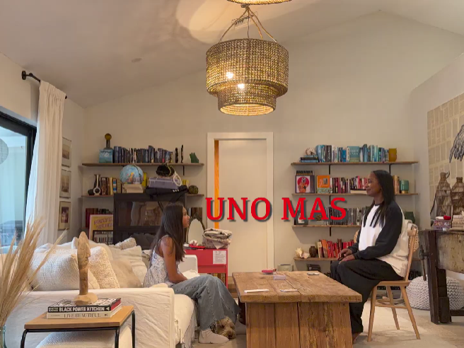
Uno Mas
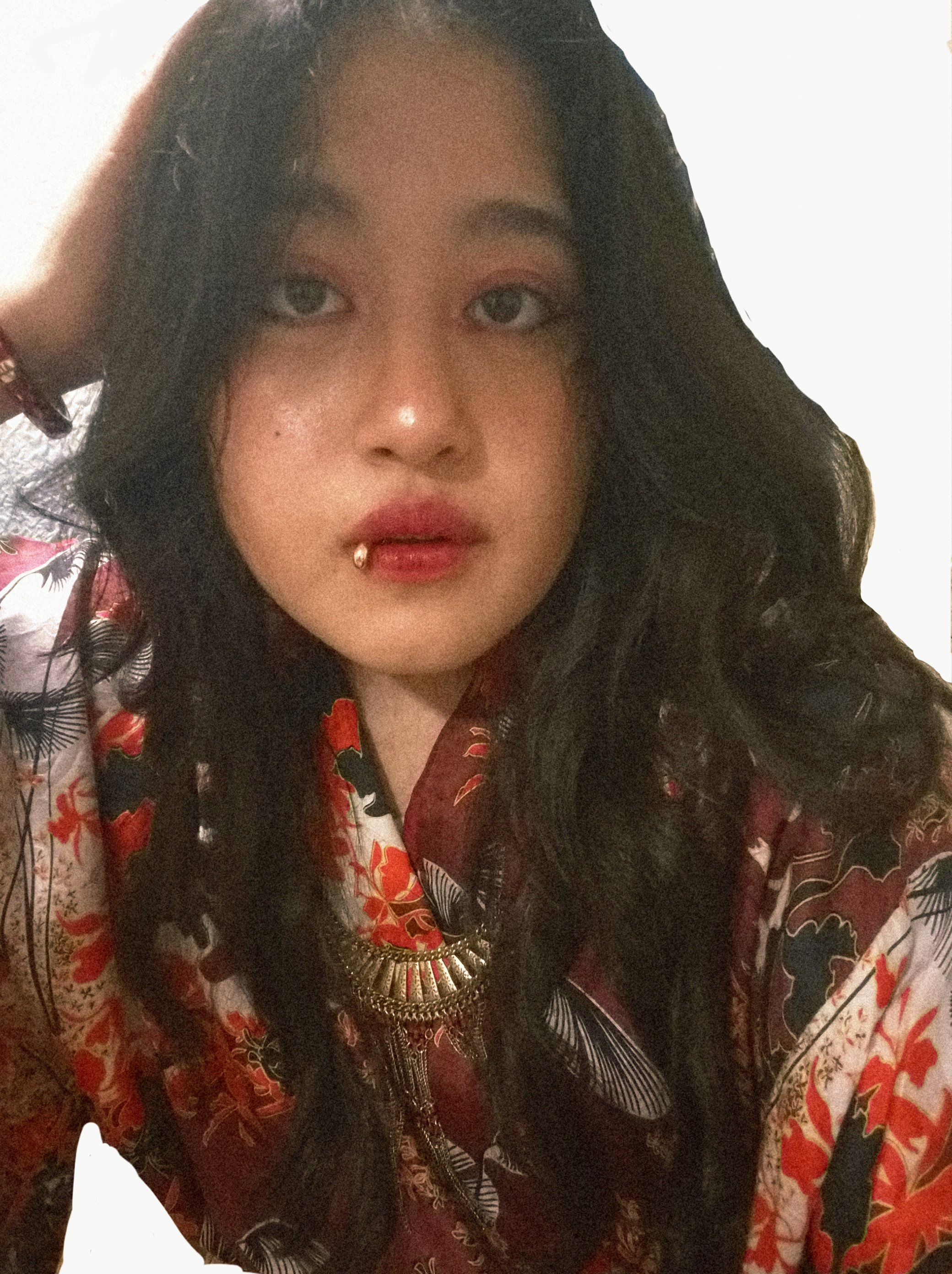
Olivia A. Alva ‘28
With all of my pieces, I love to emphasize contrast through color. I purposely utilized the two colors of red and blue in my lighting for the photograph. In the raw photo, the colors seemed pale, so I intentionally increased saturation in Adobe Photoshop so that the colors would become more intense, contrasting, but also complementing each other at the same time. The dynamic of these two colors isn't the only reason I chose them. The person in the photograph is my good friend, Julianna Gerba. Not only did she have the cool red dyed hair to match my vision for the photo, I felt as though the color red, along with the sharp clothing, could represent her boldness. The blue then comes in to represent another side of her that is also creative, as the color blue is associated with creativity. I then added a subtle glitch-like effect throughout the editing process for those who look closer to see that there are two Juliana's, one red and the other blue. That is why my piece is named "DOS," the Spanish word for two.
Bimini Linnel ‘28
I made this for my DV1 film class because we had an assignment to make a photo Roman. Originally, I was thinking about making a dark and moody poker scene between my parents, but I switched focus to doing it with my mom and me because it seemed like a lot more fun. I just wanted to show that not every film has to be scary and serious. Things can be fun when you want them to be.